⭐ Reviews Pro — Step-by-Step (Click-by-Click) Setup Guide

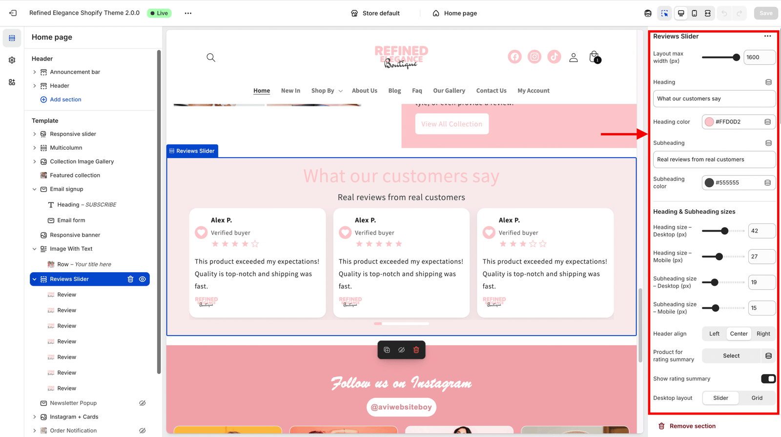
1️⃣ Add and Open the Section

  1. Open your Shopify Theme Editor.
  2. In the left sidebar, scroll down and Click Add section.
  3. From the list, find Reviews Pro → Click Reviews Pro → then Click Add.
  4. You’ll now see the Reviews Pro section appear in the live preview — this is where all your customization happens.

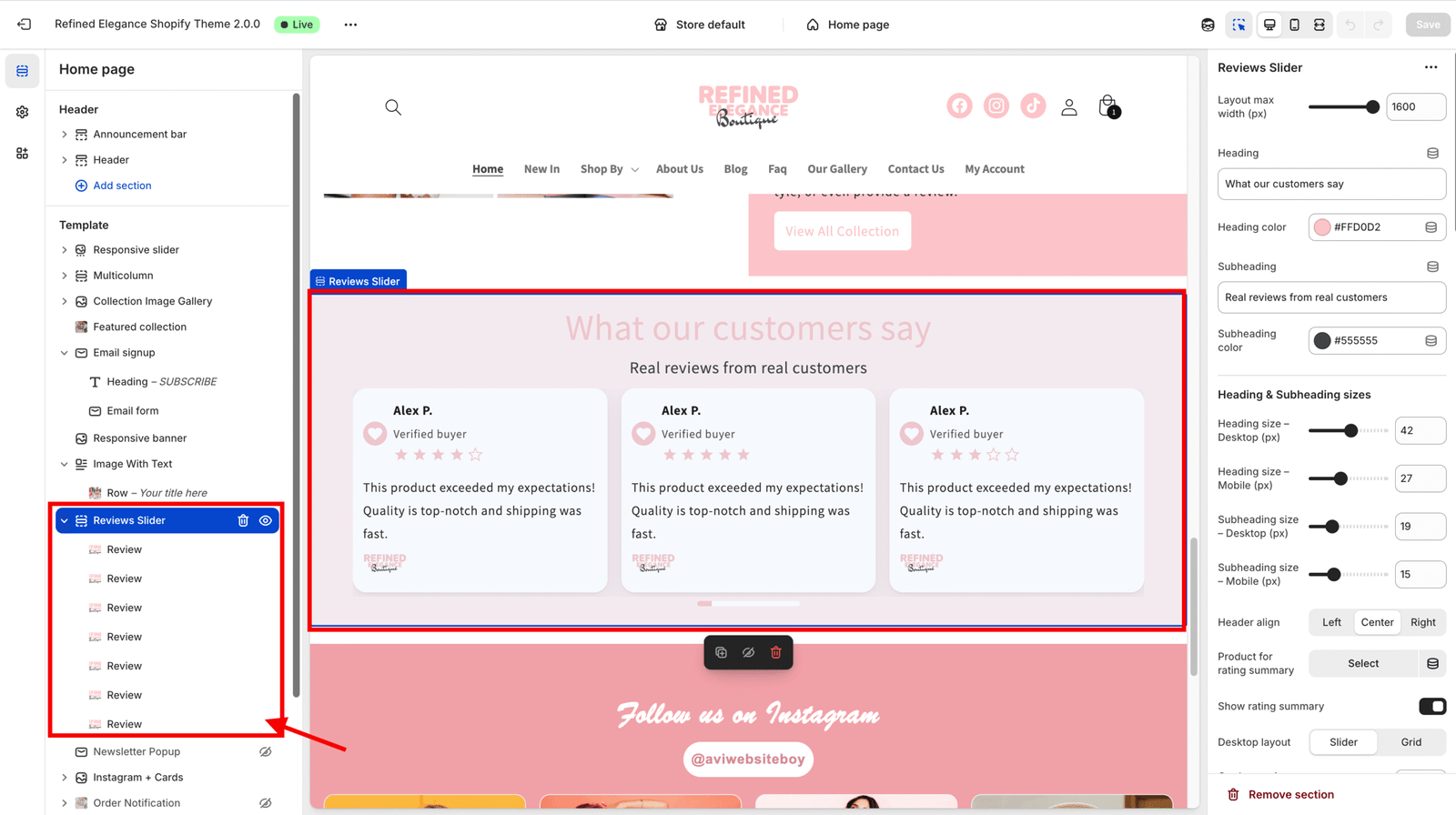
2️⃣ Add, Edit & Reorder Review Blocks

  1. Scroll to the Blocks area in the sidebar.
  2. Click Add block → select Review.
  3. Fill out block fields:
    • Author → Click field → type name → Click outside.
    • Role / Location → type supporting text → Click outside.
    • Rating → use slider (1–5 stars) → Click outside.
    • Avatar → Click Select image → upload → Click Select.
    • If no avatar → Icon Dropdown → choose quote, heart, or social → Click outside.
    • Content → Click rich text area → add review → Click Done.
    • Optional Image → Click Select image → choose → add Alt text.
    • Logo → Click Select image → choose → add Alt text.
    • CTA Label → enter button text → CTA Link → paste URL → toggle Open in new tab if needed.

3️⃣ Set Heading and Subheading

  1. In the left sidebar, Click to expand the Reviews Pro section.
  2. Find the Heading field → type your main title → Click outside or press Enter to save.
  3. Heading Color → Click the color picker → choose your desired color → Click Apply.
  4. Subheading → enter your supporting text → Click outside to save.
  5. Header Align → open the dropdown → Click Left, Center, or Right.
  6. Adjust Heading Size – Desktop / Mobile and Subheading Size – Desktop / Mobile using sliders → Click outside when done.

4️⃣ (Optional) Add Rating Summary

  1. Find the toggle Show rating summary → Click to turn it ON.
  2. Under Product for rating summary, Click the product selector → choose a product → Click the product name to confirm.
  3. Click Save (top right).
  4. You’ll now see the rating summary (stars + average + count) in the preview if your product has metafield data.

5️⃣ Choose Desktop & Mobile Layout (Slider or Grid)

  1. Desktop Layout → Click dropdown → select Slider or Grid.
    • If Slider, adjust Cards per view (desktop) using the slider.
    • If Grid, adjust Columns (desktop grid).
  2. Mobile Layout → Click dropdown → select Slider or Grid.
    • For Slider, set Cards per view (mobile).
    • For Grid, set Columns (mobile grid).

6️⃣ Control Card Spacing, Shape & Colors

  1. Card Gap (px) → drag the slider to set spacing → Click outside.
  2. Card Radius (px) → adjust corner roundness → Click outside.
  3. Card Padding (px) → set inner spacing → Click outside.
  4. Card Background → open color picker → choose color → Click Apply.
  5. Card Text Color → choose color → Click Apply.
  6. Title Size / Text Size → adjust with sliders → Click outside when done.

7️⃣ Customize Avatars, Icons & Stars

  1. Avatar Size → use slider → Click outside.
  2. Icon Size / Icon Background / Icon Color → Click each control → choose value or color → Click Apply.
  3. Star Size / Star Color → set desired look (ensure good contrast) → Click outside.

8️⃣ Configure Navigation Arrows

  1. Arrows Position → Click dropdown → select Below right, Below center, Below left, Overlap, or Hidden.
  2. Arrow Color → Click color picker → choose → Click Apply.
  3. Arrow Background → Click picker → choose → Click Apply.
  4. Adjust Arrow Button Size and Chevron Size with sliders → Click outside.

9️⃣ Set Pagination Options

  1. Pagination Type → Click dropdown → select None, Bullets, Numbers, or Progress bar.
  2. Pagination Alignment → Click Left, Center, or Right.
  3. Pagination Color and Active Color → open color pickers → choose → Click Apply.
  4. Pagination Size → adjust with slider → Click outside.

Note: Pagination only appears on devices where layout mode = Slider (Desktop or Mobile as set).


🔟 Scrollbar & Autoplay Controls

  1. Show Slider Scrollbar → Click toggle to enable or disable.
  2. (If available) Autoplay → Click toggle to enable.
  3. Autoplay Interval (ms) → type your interval (e.g., 3000 for 3 seconds) or use slider → Click outside.

13️⃣ Adjust Section Padding & Max Width

  1. Layout Max Width (px) → enter value (e.g., 1200) → Click outside.
  2. Padding Top / Bottom / Left / Right → adjust each slider → Click outside.
  3. Section Background → open color picker → choose color → Click Apply.

14 Preview & Interaction Testing

  1. Click Save (top-right corner).
  2. In the Theme Editor, switch between Desktop and Mobile preview.

Picture of Avijit

Avijit

Leave a Reply

Your email address will not be published. Required fields are marked *

Sign up for our Newsletter