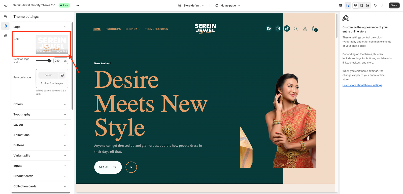
We recommend using a transparent logo for the best visual appearance. A transparent logo blends seamlessly with your header background and gives your store a clean, professional look.
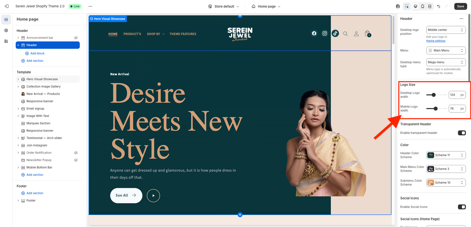
You can set different logo sizes for mobile and desktop to ensure your store looks perfect on all devices. Adjusting the logo size separately helps maintain a clean, balanced layout and improves your store’s visual consistency.
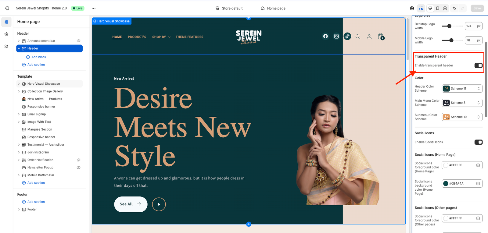
🪄 What “Enable transparent header” Does
When you check the “Enable transparent header” option in your Shopify theme customizer:
The header background becomes transparent (usually only on the Home Page).
The content (like a hero banner or slideshow) moves up behind it.
Some themes automatically switch logo color and menu text color for visibility (for example, white text over a dark image).
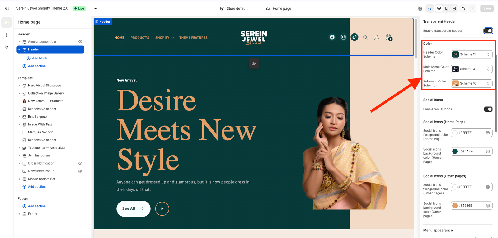
After you’ve checked the “Enable transparent header” option, scroll down to find settings like Menu Color, Transparent Header Menu Color, or Menu Text Color.
From there, you can choose your preferred color — for example:
White (#ffffff) to make your menu text visible over a dark or image background.
Or your brand color that fits the header design.
If your theme supports it, you’ll see two separate color options:
Transparent header menu color — used when the header is transparent.
Scrolled or regular menu color — used after scrolling or on inner pages.
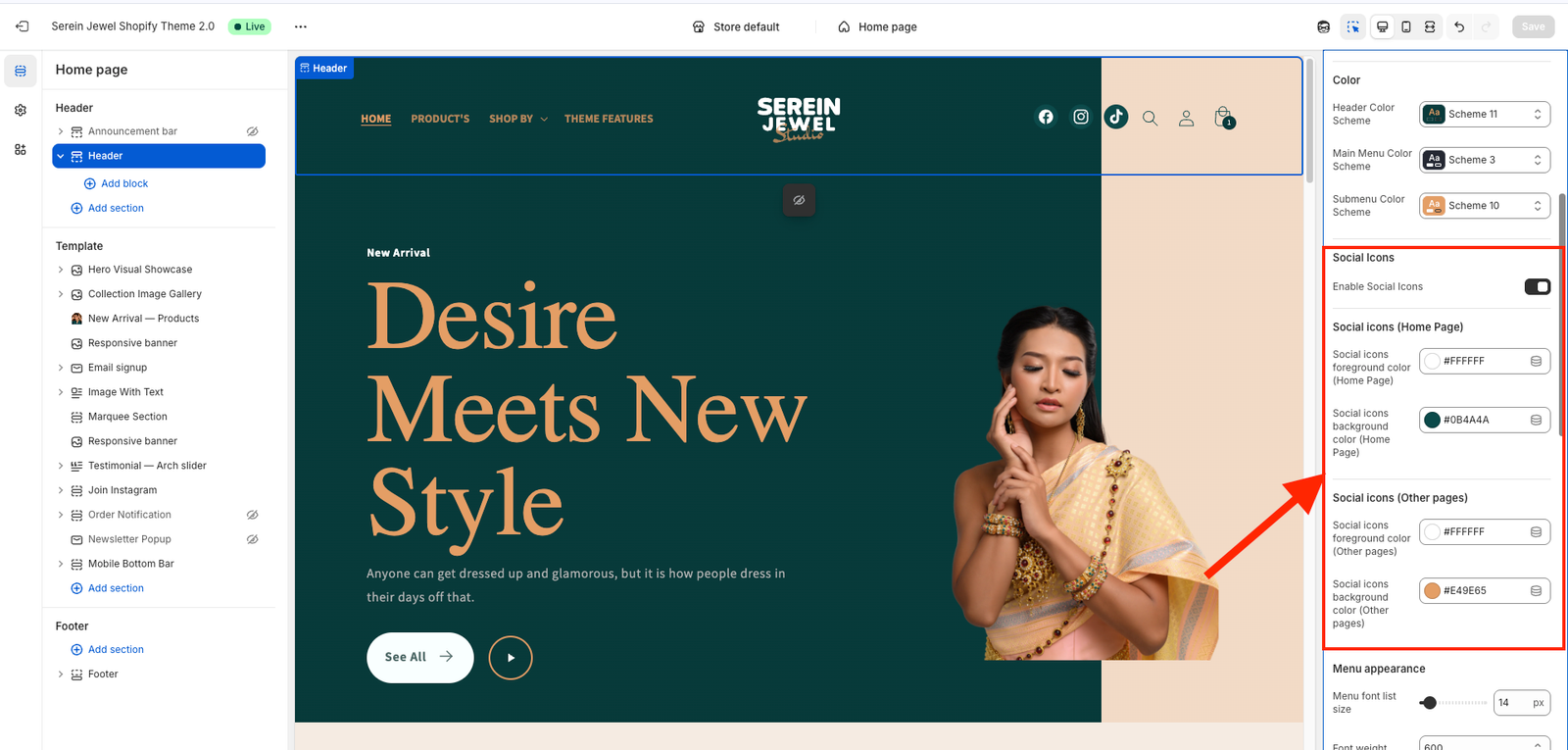
After you open the Header settings in your Shopify theme customizer, look for the section called Social Icons.
You’ll usually see these three controls:
Enable Social Icons – turn this ON to display the social media icons (Facebook, Instagram, X/Twitter, etc.) in your header.
Social Icons (Home Page) Color – choose the color you want for the icons when the header is transparent (on the home page).
Social Icons (Other Pages) Color – choose the color for the icons on all other pages (or when the header turns solid after scrolling).
Pick colors that match your design — for example, white icons for the transparent header and black icons for regular pages.
When you’re done, click Save ✅
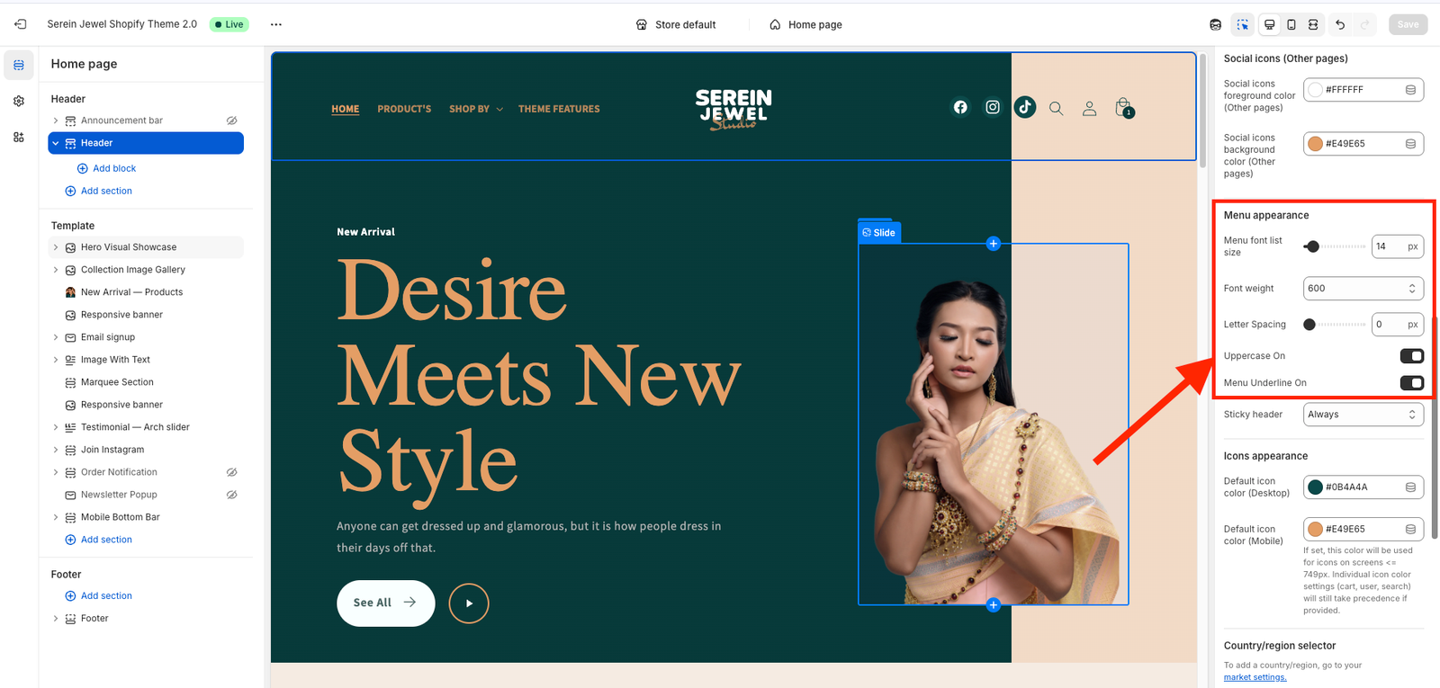
Menu Appearance – controls the overall style of your navigation menu (for example: simple, underline, or minimal).
Menu Font List Size – lets you adjust the font size of your menu links (make them bigger or smaller).
Font Weight – changes how bold or light the menu text looks (e.g., Regular, Medium, Bold).
Letter Spacing – controls the space between each letter in your menu text for better readability or design balance.
Uppercase On – when turned ON, all menu items automatically appear in uppercase letters (e.g., “HOME” instead of “Home”).
Menu Underline On – enables or disables an underline effect under your active or hovered menu items.
After adjusting these, click Save ✅
Sticky Header – controls whether the header stays visible when you scroll the page. You’ll usually see these options:
None – the header scrolls away normally (not sticky).
Always – the header always stays fixed at the top of the page while scrolling.
On Scroll Up – the header hides when you scroll down and reappears when you scroll up (a cleaner browsing effect).
Always Reduce Logo Size – when enabled, the logo automatically becomes smaller in the sticky header for a more compact look while scrolling.
After selecting your preferred behavior, click Save ✅
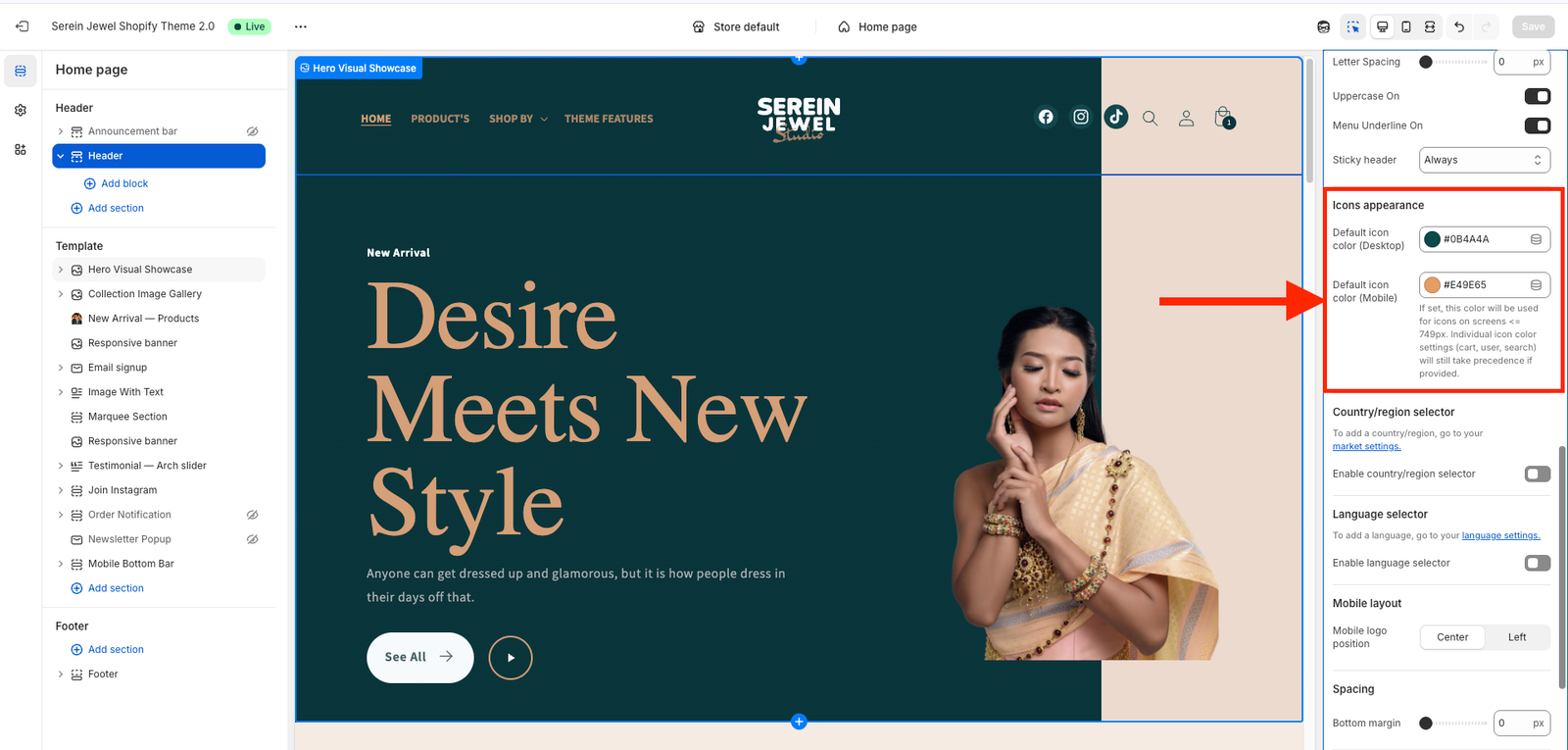
Icons Appearance – controls the overall look or style of your header icons (for example: outline, filled, or minimal).
Default Icon Color (Desktop) – sets the color of all header icons (like cart, user, search) when viewed on a desktop screen.
Default Icon Color (Mobile) – sets the color of those same icons when viewed on a mobile device.
You can use these settings to make sure the cart, user, and search icons match your design — for example:
White icons for a transparent header on the home page.
Black or gray icons for inner pages or when the header background is solid.
After choosing your preferred icon colors, click Save ✅
Mobile Layout – controls how your header looks and behaves on mobile devices.
Mobile Logo Position – decides where your logo appears in the mobile header.
Center → the logo is placed in the middle of the header.
Left → the logo appears on the left side, next to the menu icon.
Choose whichever layout fits your design style, then click Save ✅
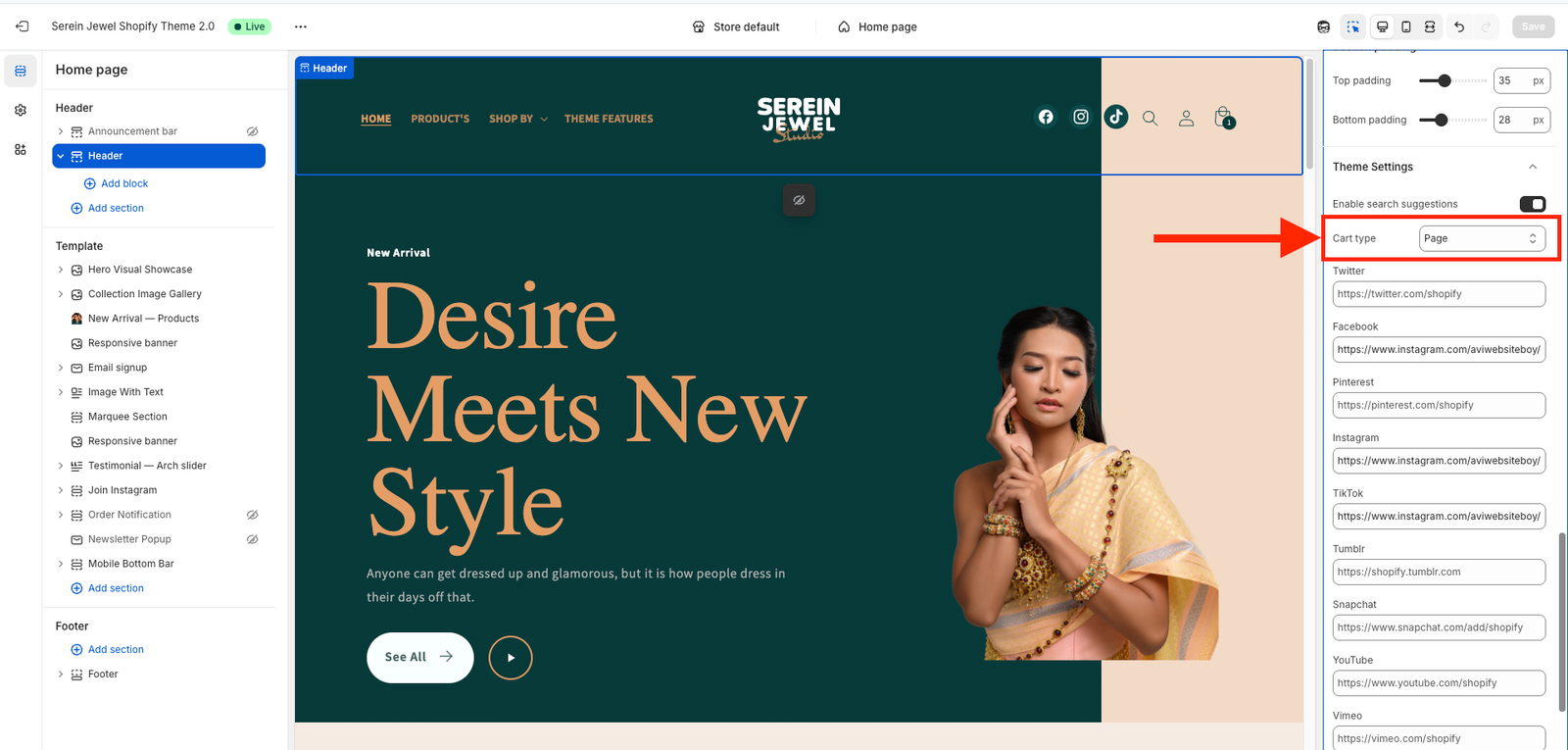
Cart Type – controls how the shopping cart opens when a customer adds a product. You’ll usually see these three options:
Page – takes the customer to a full cart page after adding a product.
Drawer – opens a side cart panel (usually slides in from the right) so shoppers can review items without leaving the page.
Popup Notification – shows a small popup message or mini cart confirming that the item was added, often with a link to “View Cart” or “Checkout.”
Choose the style you prefer for your store’s shopping experience, then click Save ✅ to apply it.
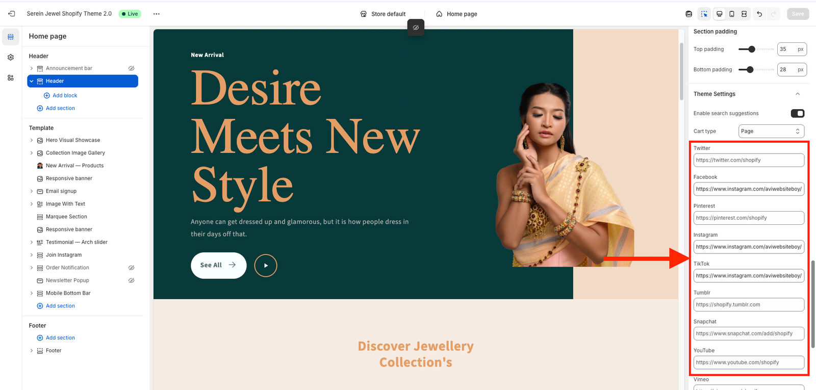
Look for a part called Social Media Links or Social Icons.
You’ll see individual fields for each platform — for example:
Instagram URL → paste your Instagram profile link.
TikTok URL → paste your TikTok profile link.
Facebook URL → paste your Facebook page link.
You may also see options for YouTube, Pinterest, Twitter (X), or LinkedIn.