Go to the page where your Gallery Section appears —
usually this will be your Home page.
In the left sidebar, expand the section named Collection Image Gallery.
Each image in the gallery is represented by a block.
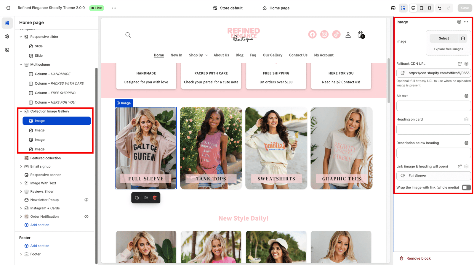
Each block includes several important fields — fill them carefully for best results.
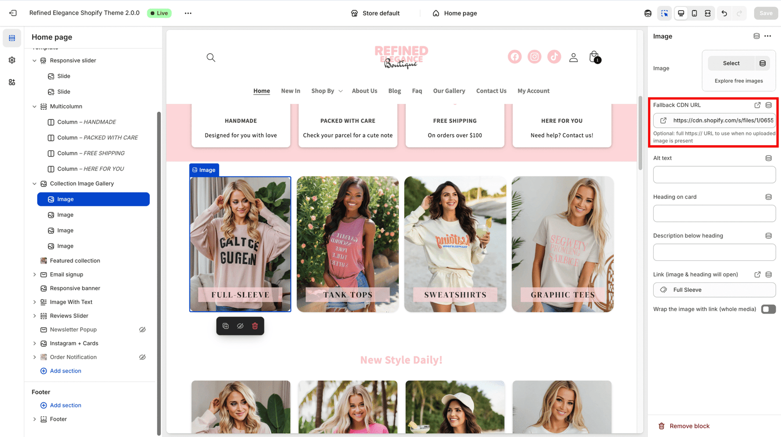
Every block starts with a demo placeholder image.
Once you upload your own image, this demo image disappears automatically.
It’s only for layout preview and will not appear on your live site.
| Field | Description |
|---|---|
| Image (image) | Main image |
| Fallback CDN URL (fallback_cdn) | Optional full image URL (used if no uploaded image exists) |
| Alt text (alt) | Essential for SEO and accessibility — always fill this |
| Overlay title (overlay_title) | The title displayed over the image |
| Overlay description (overlay_desc) | Short descriptive text under the title |
| Link (link_url) | The URL opened when clicking the image or title |
| Prefer link (prefer_link) | When enabled, the entire image/card becomes clickable |
| Setting | Description |
|---|---|
| Eyebrow (eyebrow) | Small pre-heading above the main title |
| Heading (heading) | Main title for the section |
| Subheading (subheading) | Short descriptive text under the heading |
| Header alignment (header_align) | Choose left, center, or right alignment |
| Setting | Description |
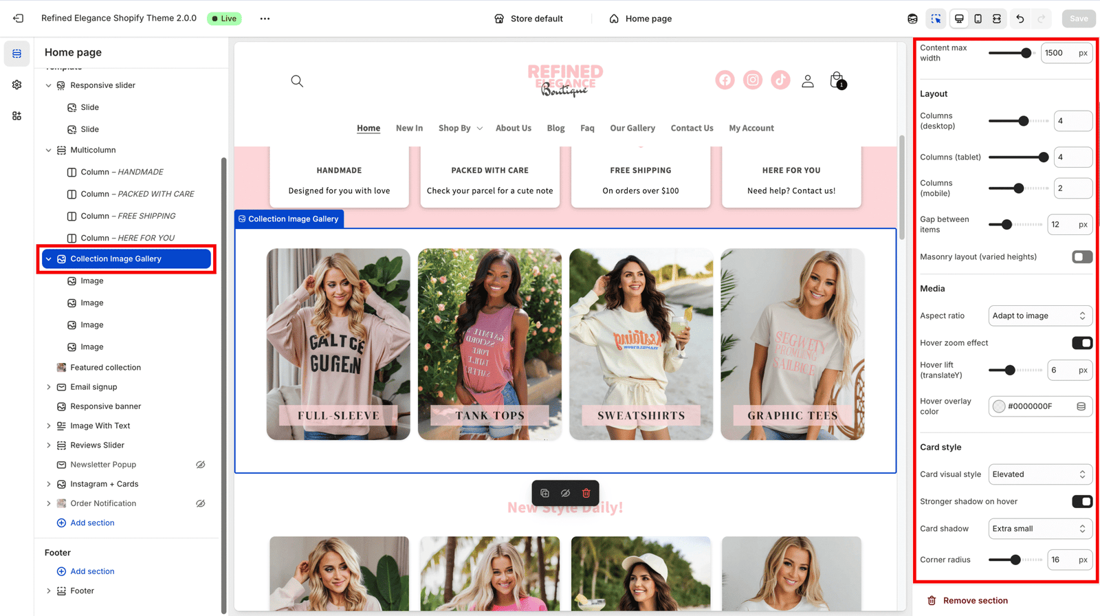
|---|---|
| Content max width (max_width) | Maximum content width (in pixels) |
| Columns (desktop/tablet/mobile) | Number of grid columns per device |
| Gap (gap) | Spacing between items |
| Masonry (masonry) | Enables a masonry-style (staggered) layout |
⚠️ Note: Masonry layout automatically disables if mobile swipe mode is active.
| Setting | Description |
|---|---|
| Aspect ratio (aspect_ratio) | Choose adaptive or a fixed ratio (e.g., 1:1, 16:9) |
| Hover zoom / Hover lift | Controls image zoom and elevation on hover |
| Overlay color (overlay_color) | Hover overlay tint (RGBA or HEX color) |
| Setting | Description |
|---|---|
| Card style (card_style) | Choose from Elevated / Glass / Gradient |
| Shadow / Radius | Adjust card shadow and corner roundness |
| Title controls | Set title position, alignment, size, weight, and color |
| Description controls | Set text color and size for overlay description |
| Setting | Description |
|---|---|
| Mobile layout mode (mobile_layout_mode) | Choose between Swipe or Grid layout |
| Show mobile arrows (show_mobile_arrows) | Toggles navigation arrows in swipe mode |
Arrow customization:
👉 The swipe logic automatically hides arrows when there’s no overflow, or when at the start/end of the list — works seamlessly in both live view and Shopify editor.
After filling out all fields:
