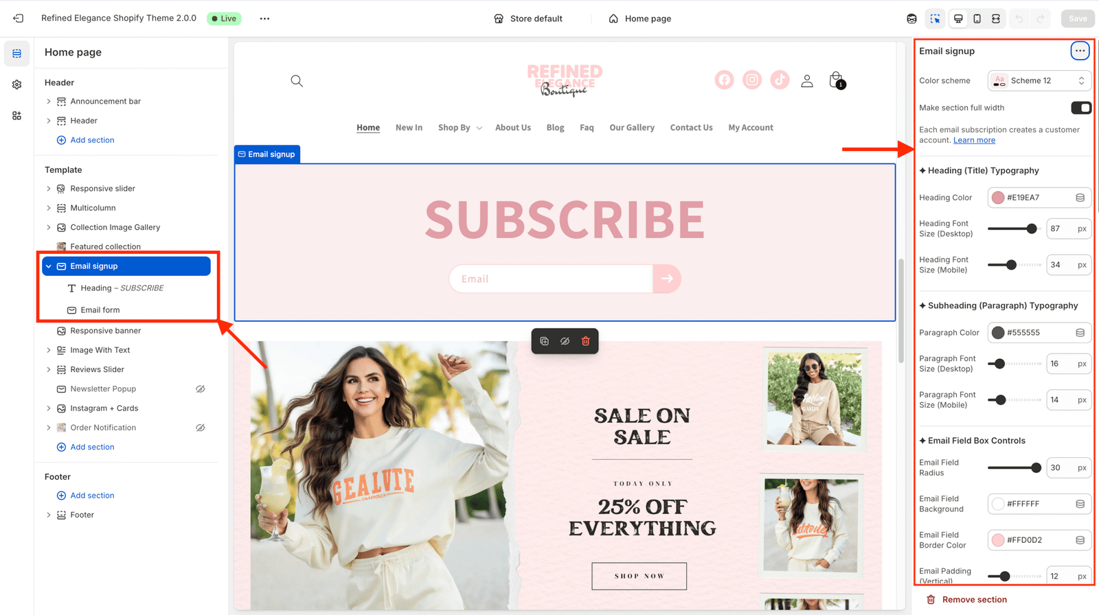
This section lets you add a beautiful, customizable email subscription form to your store, with full design control over typography, colors, padding, and button animation — all editable directly from the Shopify theme editor.

| Setting | Description |
|---|---|
| Color scheme | Select a predefined background/text color theme. |
| Full width | When ON, the newsletter spans the entire screen width. |
| Padding top / bottom | Adjust spacing above and below the section. |
The Newsletter section is made of 3 main blocks, each editable in the sidebar:
Displays the main title (e.g., “Subscribe to our emails”).
H0, H1, or H2.Adds a short description below the heading.
This is the actual signup form with:
All typography automatically uses the theme’s global fonts, but you can customize:
| Control | Description |
|---|---|
| Heading Color | Color of the main title. |
| Heading Font Size | Desktop & mobile size controls. |
| Paragraph Color | Color of the subheading text. |
| Paragraph Font Size | Desktop & mobile text size. |
You can customize how the email input box looks and feels.
| Setting | Description |
|---|---|
| Email Field Radius | Controls rounded corners. |
| Background Color | Input background. |
| Border Color | Outline color of the field. |
| Padding (Vertical / Horizontal) | Adjust space inside the field. |
| Margin (Top / Bottom) | Control spacing around the input field. |
🧠 Tip: The input field shadow automatically inherits the base button shadow for consistent style.
The submit button is fully stylable with animation, hover effects, and icon options.
| Setting | Description |
|---|---|
| Button Size / Radius | Controls button dimensions and corner rounding. |
| Button Background Color | Normal (non-hover) color. |
| Arrow Icon Size / Color | Adjust icon style. |
| Base Shadow / Hover Shadow | Customize depth and glow of button. |
This section supports interactive hover effects when enabled.
| Setting | Description |
|---|---|
| Enable Button Hover Animation | Turns hover effect ON/OFF. |
| Hover Scale | Grows button slightly (1.03, 1.06, 1.10, etc.). |
| Hover Translate Y | Moves button up/down on hover. |
| Hover Background | Sets new background color on hover. |
| Animation Duration (ms) | Speed of animation. |
| Easing | Smoothness of animation (ease-out, ease-in-out, or custom cubic-bezier). |
Make your arrow icon move or rotate during hover for an interactive touch.
| Setting | Description |
|---|---|
| Icon Nudge on Hover | Shifts icon slightly to the right. |
| Icon Rotate on Hover | Tilts the arrow (12° or 20°). |
After customizing: