Step 1: Open the Section
- In your Shopify Theme Editor, navigate to the page where you want to display the banner (for example, the Home page).
- In the left sidebar, click “Add section”.
- Search for “Responsive Banner” and click Add.
- You’ll now see your new banner appear in the preview panel.

Step 2: Upload Banner Images
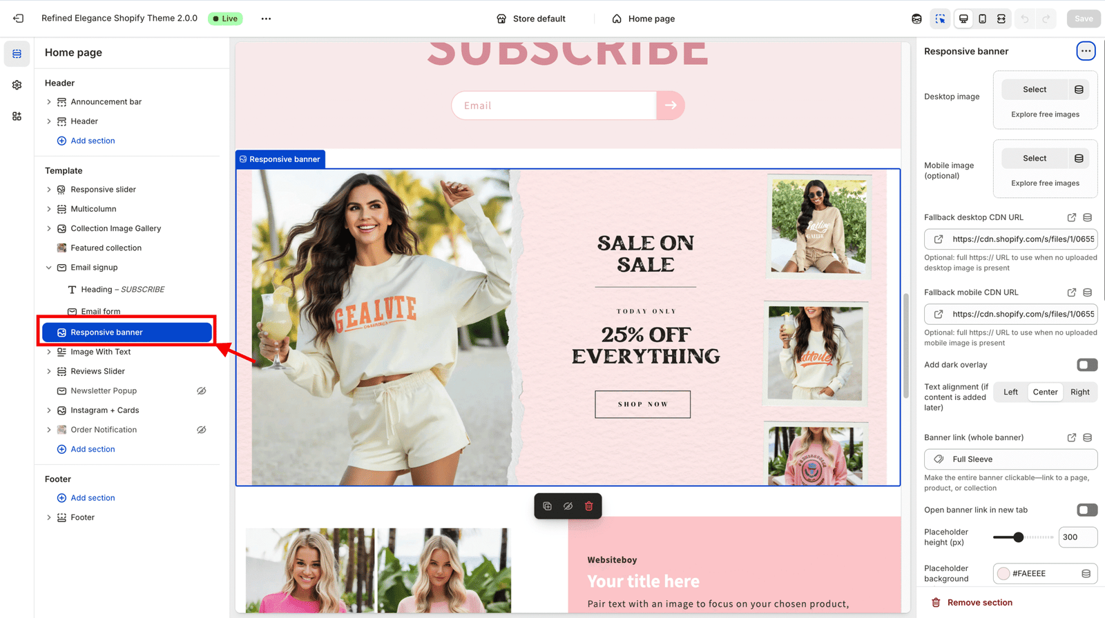
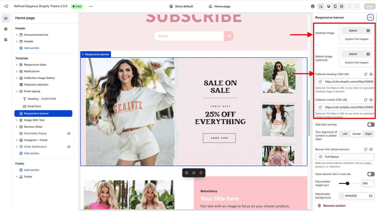
This section supports both Desktop and Mobile versions of your banner image.
- Desktop image — Recommended width: 1600–2400px.
- Mobile image — Optional; ideal for smaller screens (cropped for a better mobile fit).
The banner automatically switches between the two images depending on the device size.
🖼️ Understanding the Demo Image
- Each banner starts with a demo image placeholder so you can preview the layout before uploading your own images.
- The demo image automatically disappears as soon as you add your Desktop or Mobile image.
- It exists only for layout preview inside the editor — it will not appear on your live site once replaced.
🌐 About Fallback CDN URLs
- Fallback Desktop CDN URL and Fallback Mobile CDN URL are optional developer fields.
- You can ignore or remove them safely — they’re only used when no image is uploaded.
- For normal use, just upload your images through the image picker fields.

Step 3: Customize the Overlay & Alignment
Use these settings to control your banner’s look and feel:
- Add dark overlay — Adds a subtle dark tint on top of the image for better text contrast.
- Text alignment — Choose between Left, Center, or Right (for when you add content later).
Step 4: Make the Banner Clickable
You can turn the entire banner into a link:
- Banner link — Add a full URL to direct visitors to a page, product, or collection.
- Open in new tab — Enable this option if you want the banner link to open in a new browser tab.
Step 5: Adjust the Placeholder Card (Before Uploading Images)
If you haven’t uploaded your images yet, you’ll see a placeholder card. You can style it too:
- Placeholder height — Adjusts the preview image height (useful for keeping layout consistent).
- Background color — Choose any background color for the placeholder.
- Border radius — Set the roundness of the corners.
- Placeholder text — Optional label text like “Add Image Here”.
These settings are just for design preview — they don’t appear once your real image is uploaded.
Step 6: Control Shadow & Depth
You can give your banner or placeholder card a subtle shadow for extra depth:
- Card shadow preset — Choose from None, Subtle, Medium, or Deep.
- Custom shadow (optional) — For advanced users, enter a full
box-shadowvalue (overrides preset).
Step 7: Add Motion with Animation Controls
Make your banner more dynamic with animation options:
- Enable animation — Toggle the animation effect on or off.
- Animation type — Choose between Fade up, Slide left, Slide right, or Zoom in.
- Duration (ms) — Controls how long the animation lasts.
- Delay (ms) — Adds a slight delay before the animation starts.
💡 Tip: Use short durations (300–600ms) for natural movement.
Step 8: Preview Your Banner
- Click Save in the top-right corner of the theme editor.
- Click Preview to see how your banner appears on desktop and mobile.
- Try resizing your browser window to confirm the responsive image switching works perfectly.
✅ You’re Done!
You’ve successfully set up your Responsive Banner.
You can now:
- Swap images anytime
- Adjust overlay or shadows for better style
- Add animations for motion
- Link your banner to any store page