In your Shopify Customizer, go to the Home Page (or whichever page has your slider).
In the left sidebar, scroll down and click on the Responsive Slider section.
Step 2: Add a New Slide
Under the Responsive Slider section, click “Add Block” → “Slide.”
A new Slide block will appear below the existing ones.
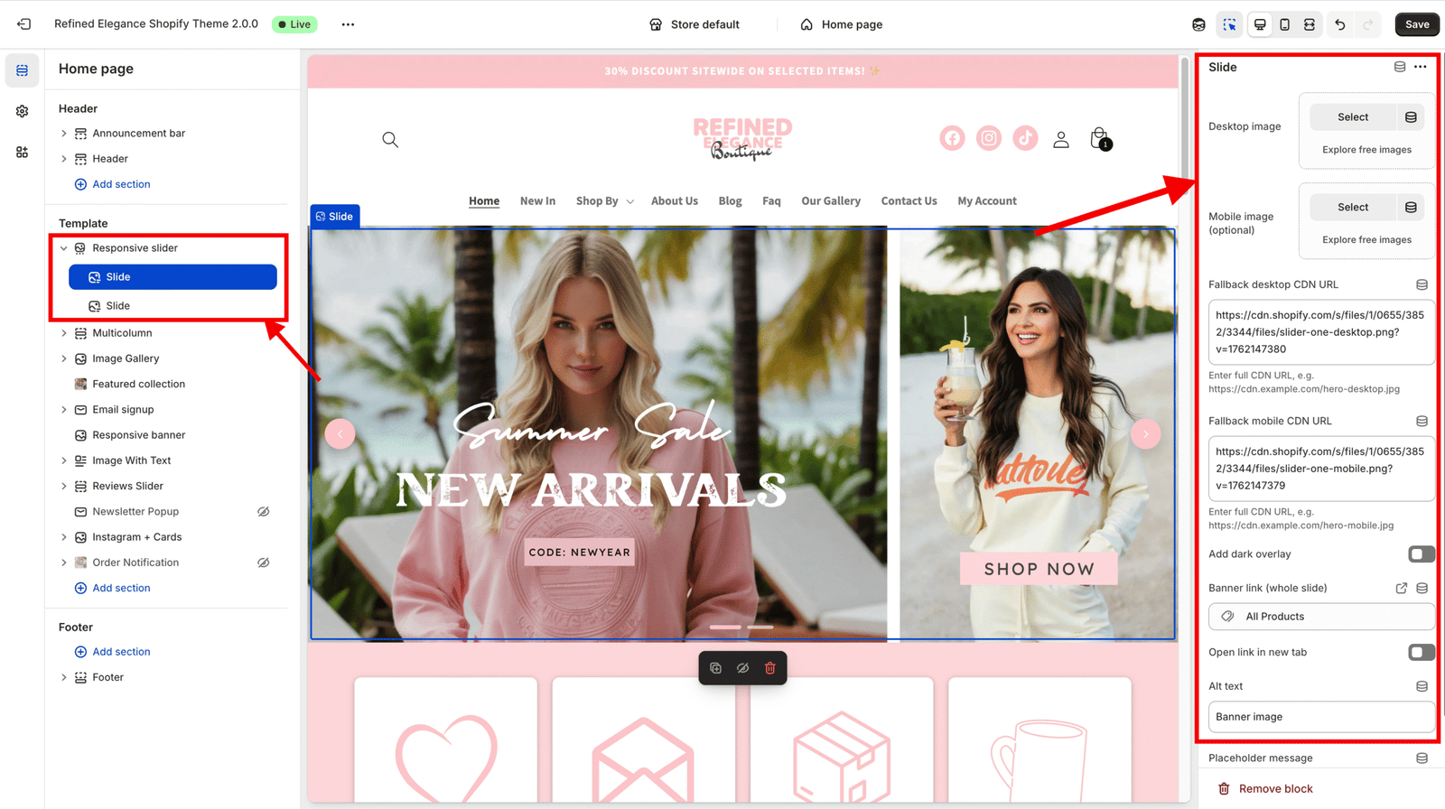
Step 3: Configure the Slide Content
Each Slide block includes settings for both images and content options:
Desktop Image: Upload a large, high-quality image (recommended width: 1600–2400 px). This version displays on desktop and large screens.
Mobile Image (optional): Upload a smaller or cropped image optimized for mobile users. If no mobile image is added, the desktop image will be used automatically.
Add Dark Overlay: Turn this ON to improve text readability — especially for light background images.
Banner Link: Add a URL here to make the entire slide clickable (e.g., link to a collection or product).
Alt Text: Always include descriptive text for accessibility and SEO benefits.
Step 4: Understand the Demo Image
Each slide starts with a demo image as a placeholder.
The demo image automatically disappears once you upload your own Desktop or Mobile image.
This is simply for layout preview — it won’t appear on your live site once replaced.
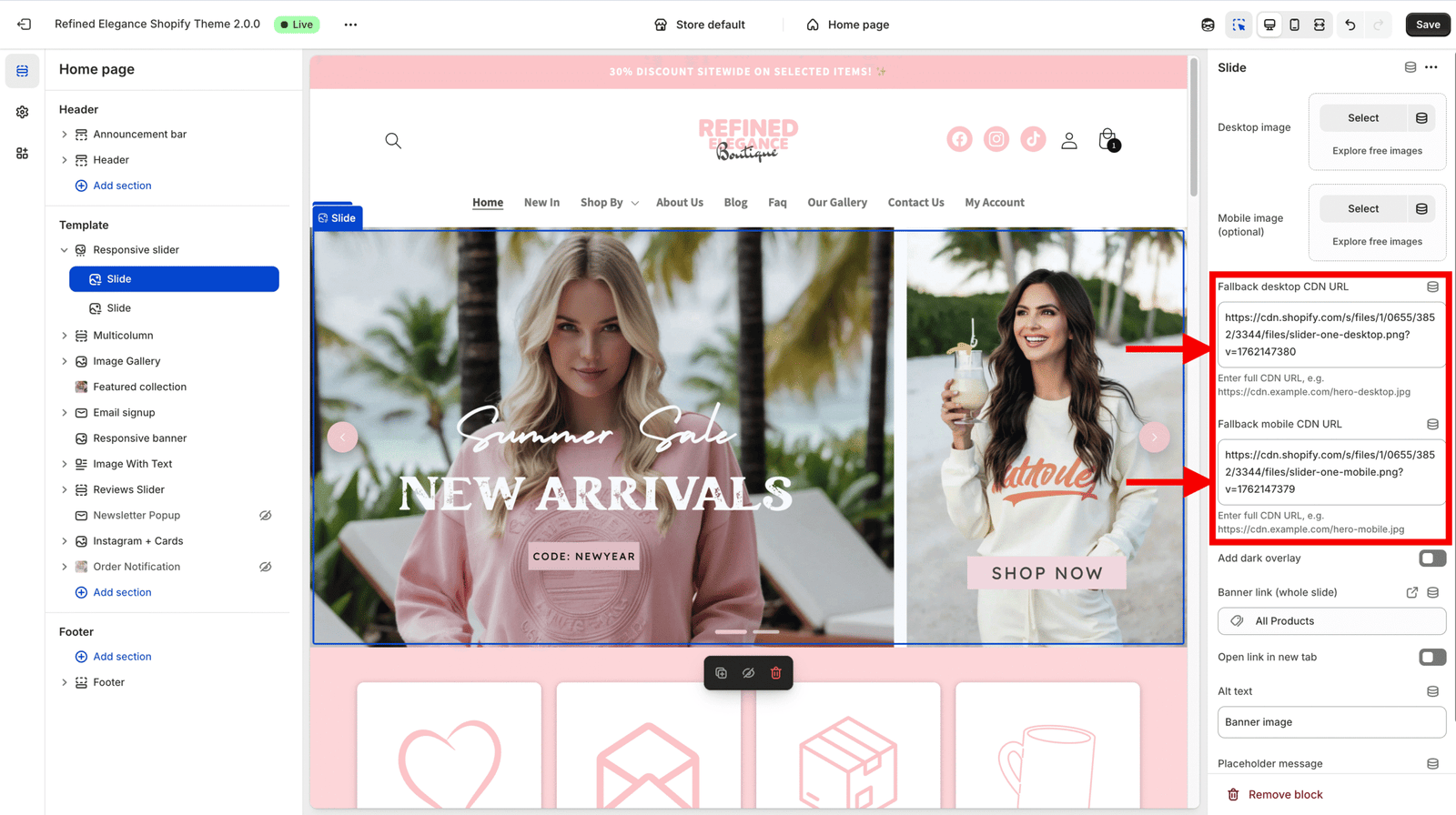
Step 5: Ignore Optional Fields
Fallback Desktop CDN URL and Fallback Mobile CDN URL are not required. These are meant for developers — you can safely remove or ignore them.
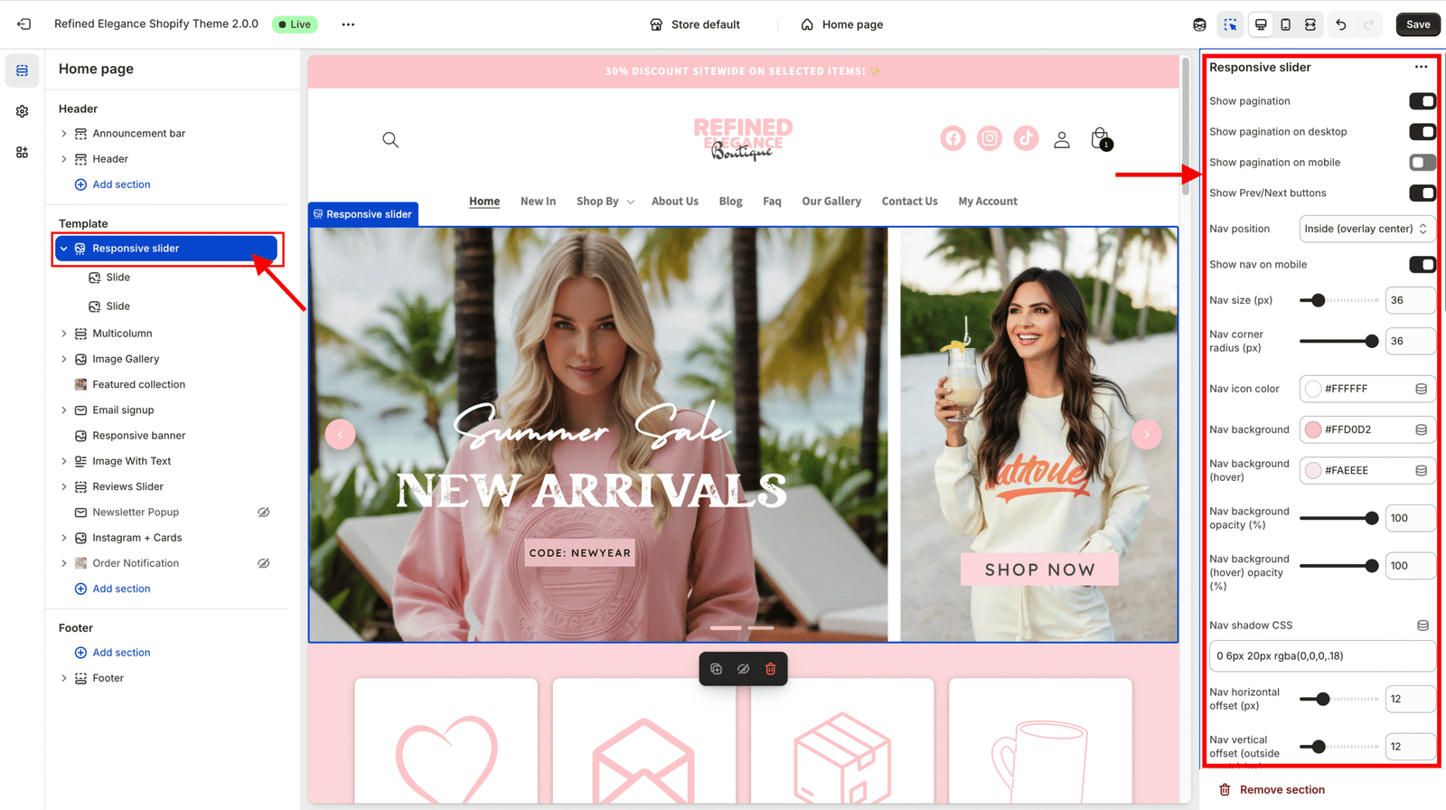
Step 6: Style Your Slider
In the left sidebar, under Responsive Slider, you’ll see layout and style controls.
Customize:
Slide height
Text alignment (left, center, right)
Overlay color or opacity
Navigation arrows and dots
Animation speed and autoplay
Adjust these according to your design preferences — you’ll see changes live in the preview.